New 2N Visual Style announced
We have welcomed in the New Year by implementing a new visual style for 2N. The main aim was to rejuvenate the graphic identity and clarify our communication. Don’t expect any revolution, 2N is a brand of many years’ standing, on firm foundations. Nevertheless, some of the details were ready for a facelift.
So what specifically can you look forward to? The logo stays, but we’ve ‘cleaned it up’.
2N is no longer just about telecomms solutions, we go further. We offer technology that changes lives. That is why we have removed the word “telecommunications” from the logo.
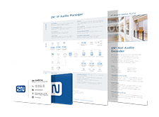
Next, we had a look at our typeface. We chose one expressive font and character-set style. This we shall be using everywhere, across all materials and marketing channels... from business cards, through digital media to product materials and packaging.
Our website will undergo its transformation in the coming months. Here, you can expect more major changes, though. Our web will not only get a facelift, but a simplified layout for better orientation and self-service, for all our customer categories. Everyone will find the information they need easier and quicker, regardless of whether they access via a desktop computer, tablet or mobile phone.
We’re sure you’re going to like our new corporate identity as much as we do, and will soon get a taste for it.